Client : Couvee
Year : 2019
Couvee is a rising coffee brand in Indonesia. It’s modern, young, and always innovating new tastes for their loyal customers. In 2017 they open their first store in Yogyakarta, Indonesia, and by 2019 they’ve been expanded to 4 stores in Yogyakarta and 1 store in Jakarta. The customer mostly is millennials, who enjoys getting a quick and tasteful coffee that they can bring anywhere.

Goals
These are the goals that the owners want to achieve with the new website.
- Brand awareness. Showing that Couvee is a premium brand, convince people that their products are tasty yet maintaining the high quality.
- So people don’t see Couvee as just “another coffee shop” among thousands of coffee shops in Yogyakarta. Having a website showing that Couvee is serious and professional.
- Showing the vibe and feel on 1 of their beautiful outlet located in Seturan, Yogyakarta.

The User & Audience
The target audience is the people who don’t know about Couvee, especially middle-age, workers, students, and of course coffee lovers.
Role & Responsibility
- Designer. I gather requirements from the client, creating wireframe, final mockup, and presenting the result to the stakeholders in a meeting.
- Project Manager. This project was done by my team Duosweb , it means i also act as a project manager who talks directly to the client and managing the timeline.
Scope
This is Couvee’s first website, so i create the site from scratch. From the look and feel, design elements, and the design of each page. These are the pages :
- Homepage
- Menu page
- Location page
- Merchandise page
- Story page (about)
- Contact page
Process
Gathering Requirement
I ask the owner some questions like the goals of the site, what they want to achieve, the look and feel that they’re looking for, and also some website inspiration. So they want really simple pages, minimalist, and not using many colors, only colors that represents their brand guideline. The important note, they want the site represents the vibe of one of their outlet in Seturan, Yogyakarta.
Website Inspiration
These are some websites that the client likes.

Sitemap
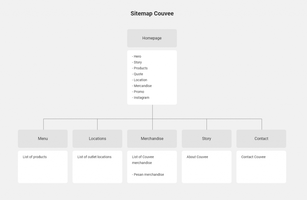
This site is very simple, i was intending to skip the sitemap but i ended up creating iy. I think it’s better to have sitemap so me and the stakeholder have the same perspective about the project even it’s a small site.

Wireframe
The next step is creating wireframe for the pages. I was asking the real content from the client to be put in this wireframe so i know how to layout it and eventually add some design decorations.

Struggle
Seeing the goal of the project, the client wants this site to represent one of their outlet located in Seturan, Yogyakarta. In the beginning, i don’t know how to do it, how to bring the store vibe into a website design. Then i have an idea, i imagine myself enter a store, and i would capture what things that make the store unique, it’s the decoration and the interior design element that used in the store itself. So I decided to go to the store, bought a cup of Couvee and also taking lots of pictures that i think makes that store unique.

Defining Design Elements
From those pictures i got more than enough inspiration that i need to create design elements that i will use in the website design.

Mockup
After i got the design elements and color from the guideline, i straight to the mockup design. And this is the initial design of the homepage.

I got some revisions from that design mockup. The first one, changing the CTA button color to ‘wood brown’. Also removing the big typography at the background, make it cleaner.

The second one is changing the footer to a lighter version. Also adding bird origami to the footer. Other than these 2 revisions are just small tweaks.

And finally, this is the mockup for all the pages.

Design Decisions
How I Use The Design Elements
I use the design elements inspired by the store interior across my design. And this is how i use them.

Hero Section

Since the client want a really clean and minimalist design, so i only show the Couvee logo and to make it interesting i add two images of hands carry Couvee cup, and it’s interactive, means it will move when the mouse moves. You can try it in the desktop version here.
To maintain the simplistic and minimalist feel, i also hide the menu links in the hamburger menu. And this is how it looks when the menu icon is clicked.

Result
After the final meeting, where i was made the revision on the spot, together with the client, the design is actually done. Then it went to development phase by my partner Ervan from Duosweb, and the site is already live.

Visit the live site here


