
Client : Jala
Year : 2019
This project is a redesign and redevelop of Jala’s old website company profile. Jala is an IoT startup in Yogyakarta, Indonesia who provides solutions to help farmers understand the farm condition better in a real-time way for preventive actions towards the risk of farming. Currently, they have 2 products, the device that can detect water condition and a web app that integrated to the device so the farm owner can see their farm condition and eventually will have a better plan to get successful harvest.

The Problem
The old website was their first website as a startup so they didn’t prepare the content and the design that well. Now as they grow bigger, they need to show their website to potential clients and investors. So they need a better content structure and of course better and fresher design to attract clients and investors.

The User & Audience
As i mentioned above, the main goal of the site is to give better information for potential clients and investors, so the obvious user here is clients and investors. But there’s also the “Career” section on the site, and it’s about what job positions that are currently opening and also the details of the job. And this ‘Career’ section will have job seekers as the user.
Role & Responsibility
- Project manager. This is a web design and development project, so i put this in my team Duosweb . I was the one who talks to the client, interviewing them, create a project summary, create a project timeline, etc.
- Designer. Of course, i am also the designer in this project. And the development phase was done by my partner Ervan.
Scope & Constraints
Actually i didn’t start from scratch, because they already have a design draft for the homepage. And most important part, they already figured out about the content structure which they write on Dropbox paper, so everyone can edit and view it.

So, i design the homepage design from the draft and develop it. Then i also design all the inner pages. Lucky me they have an in-house illustrator, so they already have some beautiful illustration assets to use. The list of the pages that i designed was :
- Homepage
- About page
- Product page
- Career page
- Career detail page
- Contact page
Process
Gathering Requirement
Since i and the client are in the same city, Yogyakarta, we decided to start the project by meeting at a cafe. Talking about the problems, the goals, the scopes, and the budget. These are notes that i took after the meeting:
- They want a clean UI, uncluttered, easy to read and navigate
- Blue color as CTA buttons
- The keyword for the design inspiration : Data visualization, iOt design, Ai farm mangamenet, data driven farming.
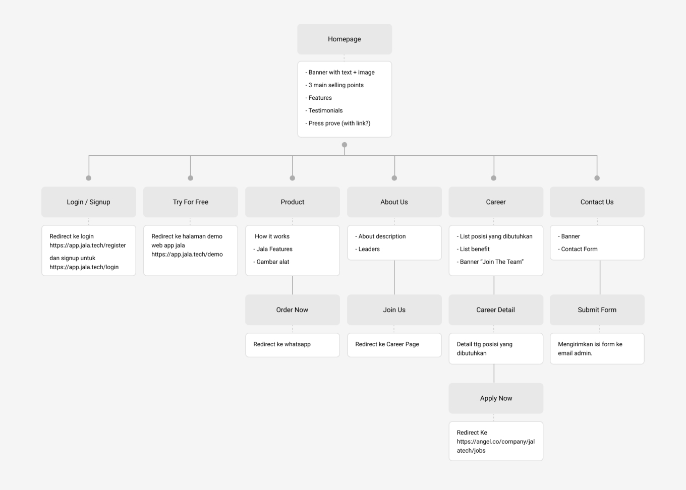
Sitemap
Since they already have the content structure, the first step that i took when we have a deal was creating a sitemap so everyone can see the whole structure of the website. This sitemap is very useful to see how big the scope is and also as my guide when designing the pages. When the sitemap is done, i sent it to them for approval before continuing to the next step, wireframe.
Websites for inspiration
I’ve got some inspiration from the client. Most of these websites are the company who has similar products, which is water IoT device. I found some great visualization about what they expect immediately. And i ended using some layout and design approach from these inspiration.

The inspiration above mostly about the layout and the content structure. Then i am looking my own inspiration for the look and feel. The inspiration i’m looking for is websites that using white background, clean, and using blue as the main color and CTA. And these are websites that i found.

Wireframe
After the sitemap is approved i proceed to wireframe process. In this wireframe, i use the actual content from them and also the layout that i propose to present the content, so they know how the page would look like. I find this wireframe process is very important so i and the clients can focus on the content first. I designed the wireframe for all the pages.

They approved most of the pages above, on some small revisions. The first one is the hero section on product page. They didn’t know what they want to show at first so i assume only showing 1 product. Revised so the section shows 3 products.

Still on the same page, they want the ‘google play’ section can be different so it draws more attention from the user.

Defining Colors and Design Elements
Before heading to the mockup, i did some research what colors should i use, based on the branding and what company do. Also i compare it to the competitors. Beside colors, i also research what design elements should i use for pages, and i came up with these.

Mockup
After some feedback on the wireframe in figma file and their approval, i continue to the mockup phase. I ended up using most of the layout from the wireframe which means they agree with my design proposal. Filling the images, creating some design elements to emphasize the meaning of the site, adding colors, and refining the layout.

I told them at the wireframe phase to get the fixed content and layout. The result, in this mockup phase they didn’t ask for revisions, only changing on some images. And they already have the images ready at the time the mockup is done.
Icons
I download free icons from internet, then i modify the color so it match with the Jala brand.
Design Decisions
Hero Section
In the hero section, they wanted to show the product. In the old design, they use video as background, which actually can show the product really well, but the problem is it’s a video that uses a lot of data, and internet connection in Indonesia is not always stable. So, i think it’s better to show the product with an image instead. I am still using the video, but i put it next to “Try for free” button, so visitors still can watch the video if they want to. Besides, the white background can blend really well with the overall clean theme of the brand.

Features Section
They think this section is too static, and they also want to show more content here especially images that represent each feature. Then we decided to use side tabs on this section. Yes ‘we’ because it’s actually an idea from them and i think it’s a great idea so i implement it. So, the user can click on each tab then an image will appear next to the tabs. Not only that, we use an animated gif so it can show the dashboard interaction.

CTA
I put the CTA section again at the bottom of every page, so after scan the whole page, the user knows what to do next.

Result
With some feedback and revisions, the final design is finally done. Then the next step is the development process by my partner in Duosweb, Ervan. After about two weeks of development the site ready to deploy and now you can see it in action.

Visit the live site : Jala Website


